Lab · auth
Sign in, Sign up
before and after
The two doors into the account are the plainest screens in the app. The reference we liked
puts the product’s world in the top half and a headline with a point of view under it. We already own the
world — the landing plates — so the after here is built from them, in CSS, at the phone’s real size.
Argue with it in this file before anyone touches login.tsx.
Create Account
app/(auth)/signup.tsxThe first screen a new user reaches after the carousel. It should feel like the carousel continued, not like the marketing stopped.
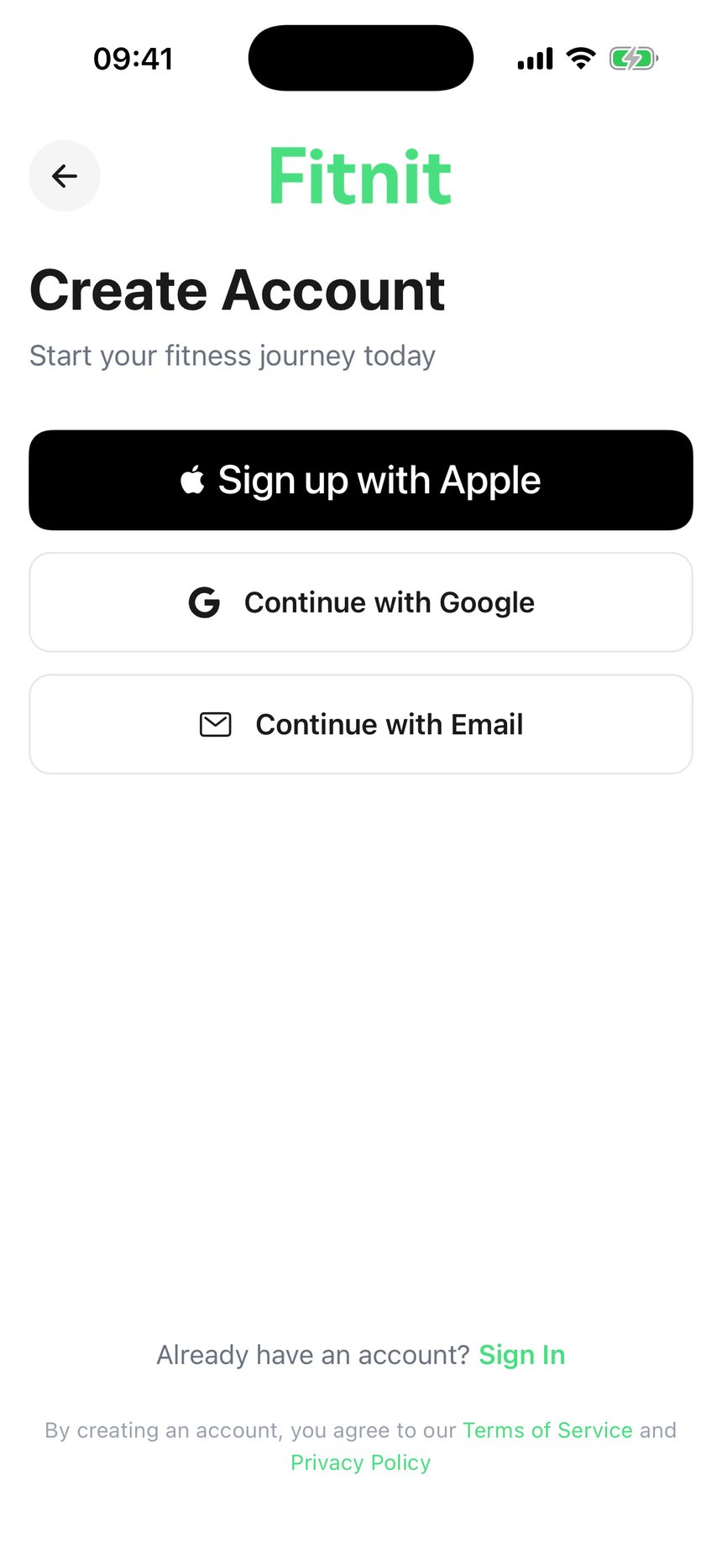
Wordmark, a form title, three buttons, and 40% of the screen empty.

Show up.Every day.
Reps counted by your camera, meals logged from a photo, friends who notice.
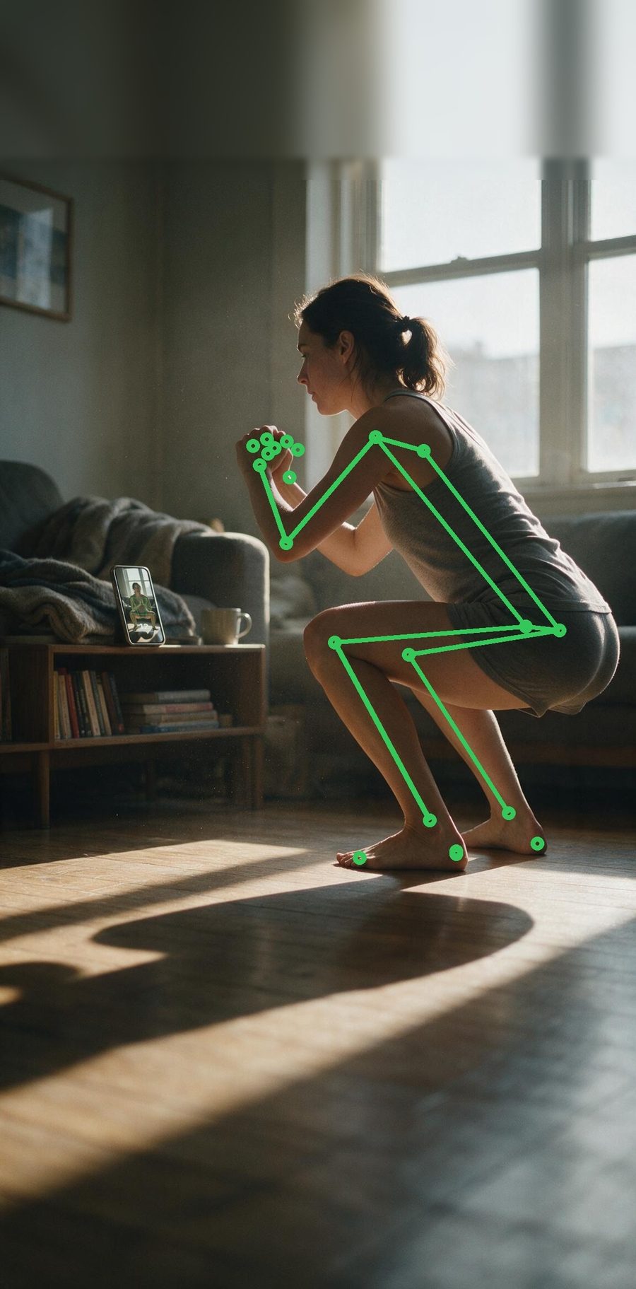
The squat plate from the carousel, back and wordmark as glass pills on it, a two-line headline with the second line in green. Three buttons, same weight.
Your form,counted.
Point the camera. Fitnit does the rest.
Headline drops onto the photo, white over a dark scrim, so the plate gets ~58% of the screen. Same three buttons.
assets/landing/slide-1.jpg — already in the bundle, already has the skeleton and the phone. Full-bleed from the top edge like landing; the headroom baked in for the Dynamic Island carries over.GlassSurface, tinted by default). That is the whole vertical saving — the header row and its margins go.signup-email.tsx as it already does.A is the safer read: copy on paper keeps contrast trivial. B is the better poster but the white headline needs the scrim, and that scrim has to be measured over the actual plate on device — the same lesson as the glass tint. Both now carry the same three equal-weight buttons, so the only difference between A and B is where the headline sits.
Sign In
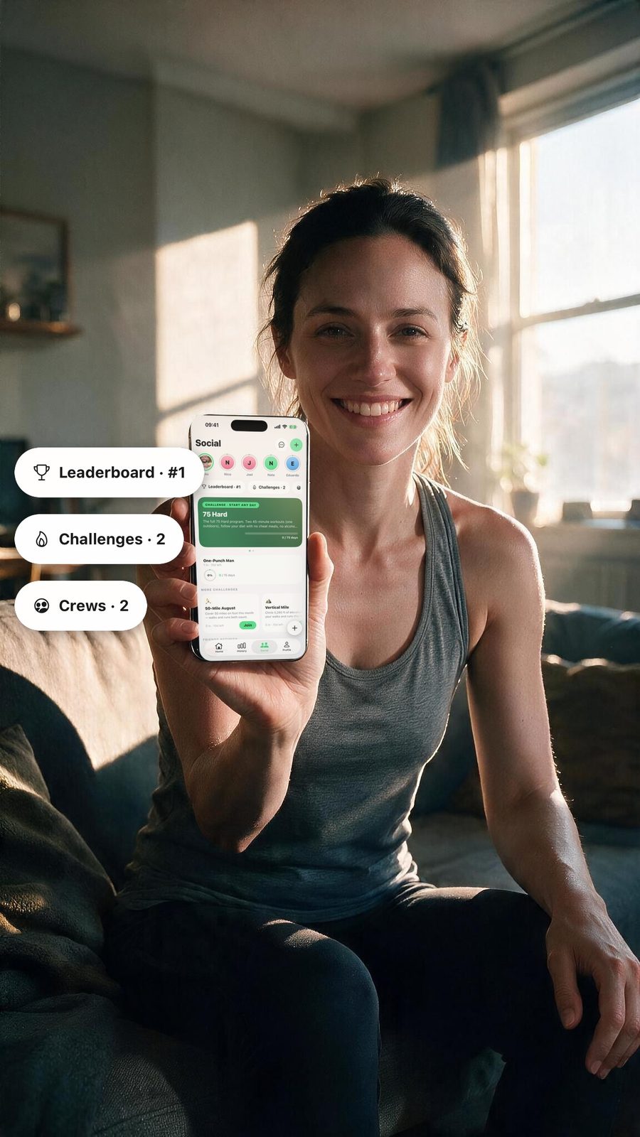
app/(auth)/login.tsxA returning user. The plate should say “your people are here”, not “here is a form” — slide 3 is the one with a friend holding up her leaderboard. The form itself moves one page deeper.
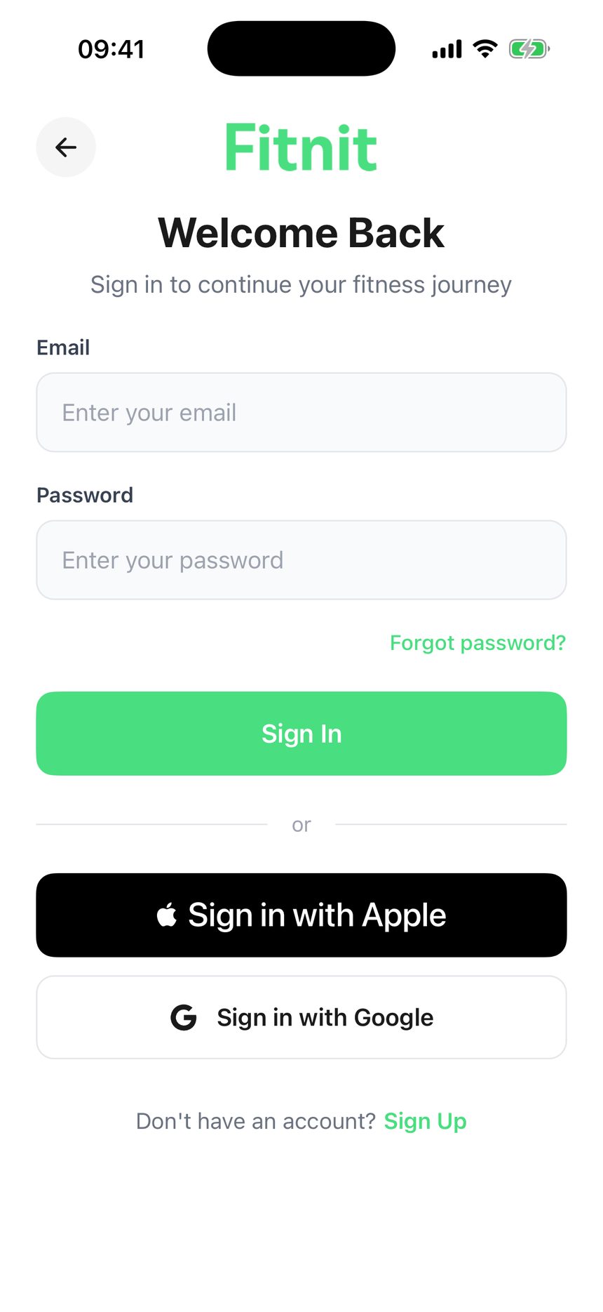
Fits on one page now, but it is still a form with a title.
Welcome back.Pick up where you left off.
Same shape as Create Account. The email and password fields move to their own page, reached by the third button.
Welcome back.Your crew kept going.
Catch up.
Headline on the photo. No form here at all, so the keyboard never touches this screen.
assets/landing/slide-3.jpg, cropped to keep her face and the phone. Same 50% as Create Account — the two doors are the same shape.login-email.tsx holding the email and password fields, Forgot password, and the Sign In button — the mirror of signup-email.tsx.Sign In does not need to sell — the user already has an account. Its hero is there so the two doors look like the same building, and moving the form off it is what lets them be the same building.
The knobs
edit<style id="after"> in this fileEverything arguable in the mockups is a CSS variable on .mock. Change it, reload, decide. Per-phone overrides sit inline on that phone’s .mock.
--hero50% / 44%How much of the screen the plate gets. Sign Up can afford more than Sign In.
--fade58% / 70% in BShare of the hero that fades into paper. Larger = softer, and the plate reads smaller.
--h-size36pxHeadline. The reference is ~40 on a 390 frame; ours is left-aligned so it can afford to be a touch smaller.
--accent#49DE80The second headline line and the primary. From landing.tsx, not the theme file — auth is pinned light.
--btn-h54pxPrimary control height. 54 matches the Apple button as shipped.
--plate-poscenter topWhich part of the plate survives the crop. Slide 3 wants ~8% down to keep her face and the phone.
What happens when we pick one
The mock is CSS, so nothing here is proof the app can do it. The build is small — login.tsx, signup.tsx, and a new login-email.tsx that takes the form off Sign In; no new assets — and it lands on the simulator with the same deep links, so the “after” column gets replaced with real captures the same day.
One thing only the device can settle: the headline contrast in B over the real plate. Measure it, the way the glass tint was.
xcrun simctl openurl <udid> "fitnitios://signup"
xcrun simctl openurl <udid> "fitnitios://login"