Fitnit Lab / Landing — drawn or shot
Draw it
instead
The three pre‑onboarding slides are photoreal plates today. This board asks whether flat illustration in Fitnit green reads friendlier and more deliberate — four directions on the same slide, seated in the real landing layout, so the comparison is a screen and not a moodboard.
What ships today
v1.121.2 · assets/landing/slide-*.jpgPhotoreal plates, full‑bleed from the top, fading into white so the copy sits on paper. They are handsome and they are also anonymous — the person in them is nobody the user knows, and slide 1 needed headroom baked into the asset to keep her head off the Dynamic Island.
Slide 1 rep counting
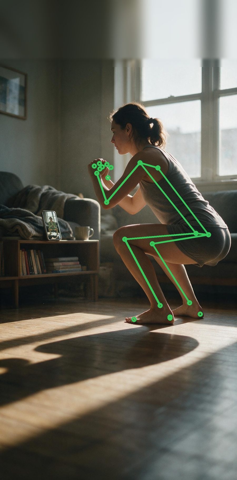
AI-powered rep counting
Point your camera and Fitnit counts your reps and tracks your form in real time.
Slide 2 nutrition
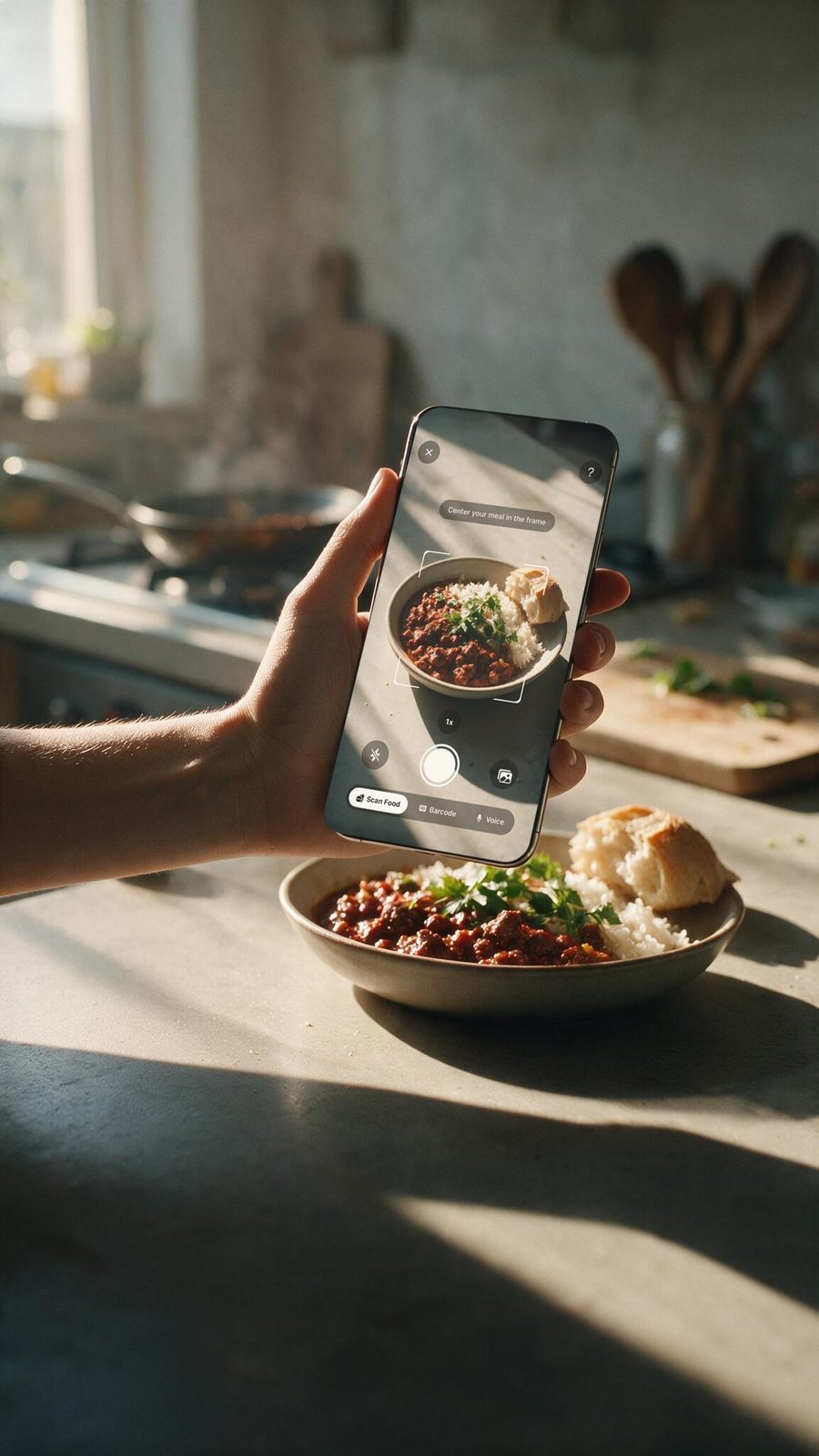
Effortless nutrition tracking
Snap a photo, scan a barcode, or search thousands of foods to log meals in seconds.
Slide 3 friends
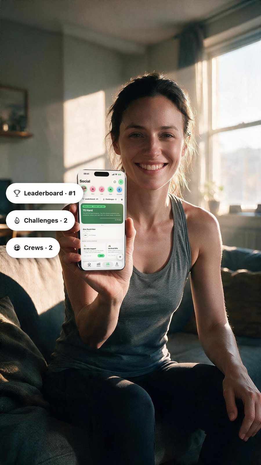
Stay accountable with friends
Daily challenges, leaderboards, and shared streaks keep you showing up.
Four ways to draw it
same subject · same copy · same layoutOne subject — a push‑up with the phone on a tripod and the pose markers running down the body — drawn four ways. Everything else on the screen is held constant so the only variable is the treatment. The drawn plate needs no gradient: the artwork already sits on white, so the copy has paper under it from the start.
A flat editorial
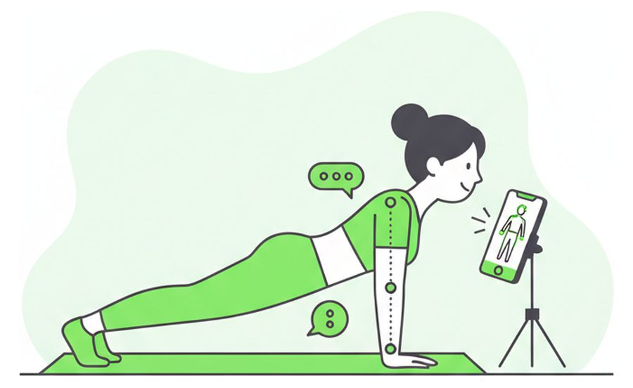
AI-powered rep counting
Point your camera and Fitnit counts your reps and tracks your form in real time.
Closest to your reference. Thin charcoal line over flat green fills, one mint blob behind the figure. Warmest of the four and the easiest to extend to twenty more screens.
B duotone geometric
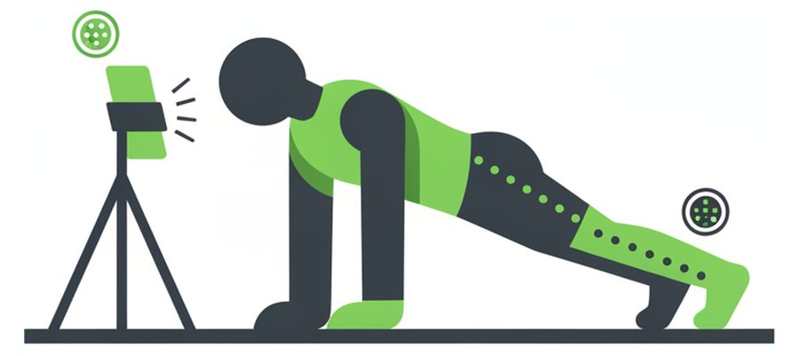
AI-powered rep counting
Point your camera and Fitnit counts your reps and tracks your form in real time.
Two colours, no outlines. Strongest at thumbnail size and the most "designed", but the faceless silhouette reads colder — further from friendly than what ships now.
C soft rounded
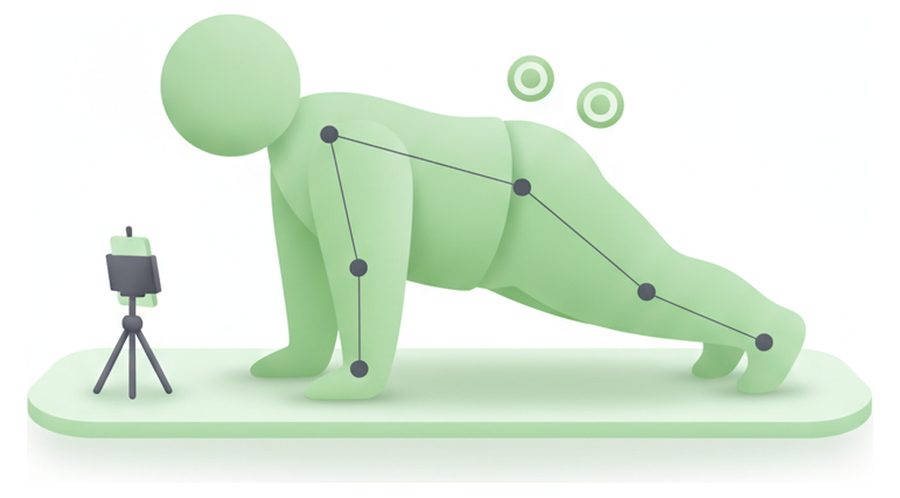
AI-powered rep counting
Point your camera and Fitnit counts your reps and tracks your form in real time.
The wellness-app look. No outlines, soft gradients, one green family. Calm, but the anatomy goes vague fast and the pale green loses the brand hue — weakest of the four as drawn.
D line first
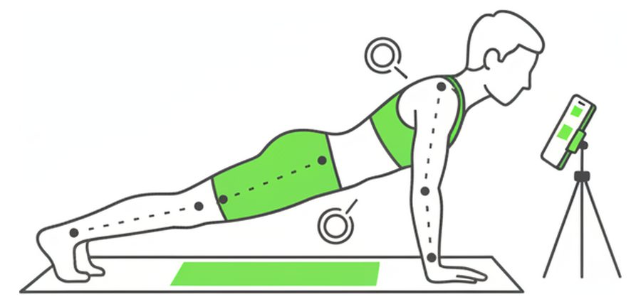
AI-powered rep counting
Point your camera and Fitnit counts your reps and tracks your form in real time.
Most premium, least friendly. One ink weight with green used only as an accent. Reads editorial and grown‑up; it also reads a little clinical next to a green CTA.
The framing you see is not the model's. Every render came back with a third of the canvas empty; a trim step crops to the drawing's own bounding box and re‑pads it evenly, which is deterministic and never needs a re‑roll. Arguing with the prompt about composition was the slower path.
Direction A, all three slides
style-matched off the A plateThe question a single slide can't answer is whether a drawn set holds together. These three were generated with the A plate attached as the style reference, so the line weight, the green and the mint blob carry across. Swipe them in your head: same figure language, same ground line, same palette.
Slide 1 a squat, not a push-up
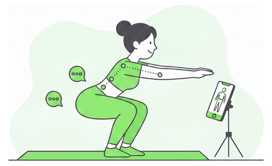
AI-powered rep counting
Point your camera and Fitnit counts your reps and tracks your form in real time.
A squat reads the pose markers better than a push‑up — the joints are further apart, so the tracking dots are legible at phone size.
Slide 2 nutrition
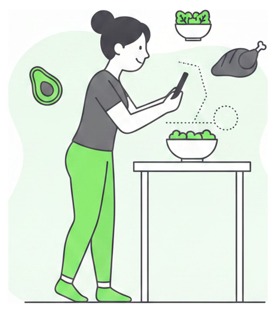
Effortless nutrition tracking
Snap a photo, scan a barcode, or search thousands of foods to log meals in seconds.
Taller composition than the other two, so it fills the plate best. The floating food shapes do the work the photo could never do — they name the feature.
Slide 3 friends
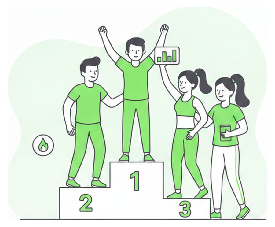
Stay accountable with friends
Daily challenges, leaderboards, and shared streaks keep you showing up.
Four figures is more than a phone plate wants. If A wins, this one gets redrawn with three, and the podium numerals get dropped — drawn text is the one thing a generated plate must never carry.
What is adjustable
edit <style id="mock">, reloadEverything worth arguing about is a custom property at the top of the mock stylesheet. Change it here first; the React Native change is mechanical afterwards.
--plate58% / 34%Share of the screen the artwork gets. Photoreal fills it; a drawn plate is wide and short, so it takes a third and hands the rest back to the copy.
--gutter32pxCopy inset, straight from styles.copy in landing.tsx.
--h-size28pxHeadline. Unchanged from what ships.
--accent#49DE80The app green, from ThemeContext.tsx. Every illustration was prompted to this hex.
.drawnclassContains the artwork instead of cropping it, and drops the white fade. A drawn plate needs no gradient.
One real risk in going drawn: the photoreal plates are also the App Store screenshots' visual language. If the carousel becomes illustration and the store stays photographic, the install‑to‑launch moment stops matching. Picking a direction here means picking one for the store listing too.
Next round
Style first, then the set — the same discipline the achievement icons used. Say which letter and what to change about it, and round 2 is that one direction only:
- Redraw all three slides in the chosen direction, two seeds each, with the reference attached.
- Fix the known faults: green pushed to a true
#49DE80, three figures on the social slide, no numerals anywhere. - Seat them at the real 9:16 plate size and re‑shoot this board from the simulator, not from CSS.
Nothing lands in app/landing.tsx until a direction is picked here.