Fitnit · landing carousel · fal.ai

Landing
b-roll

Replacing the three Ionicons glyphs in app/landing.tsx with photoreal plates, generated on fal.ai. Fitnit's real UI is composited on afterwards — none of these frames contains any app interface, deliberately, because a generative model cannot draw Fitnit and the phone screen is the exact thing being sold.

model seedream/v5/pro 1152×2048 18 images spent $1.37

Slide 1 — style round

rep counting · 4 directions

One concept in four visual directions, so the round tests style and nothing else — subject, staging and framing rules identical in all four prompts. warm-domestic won and is now the locked look every other slide has to match.

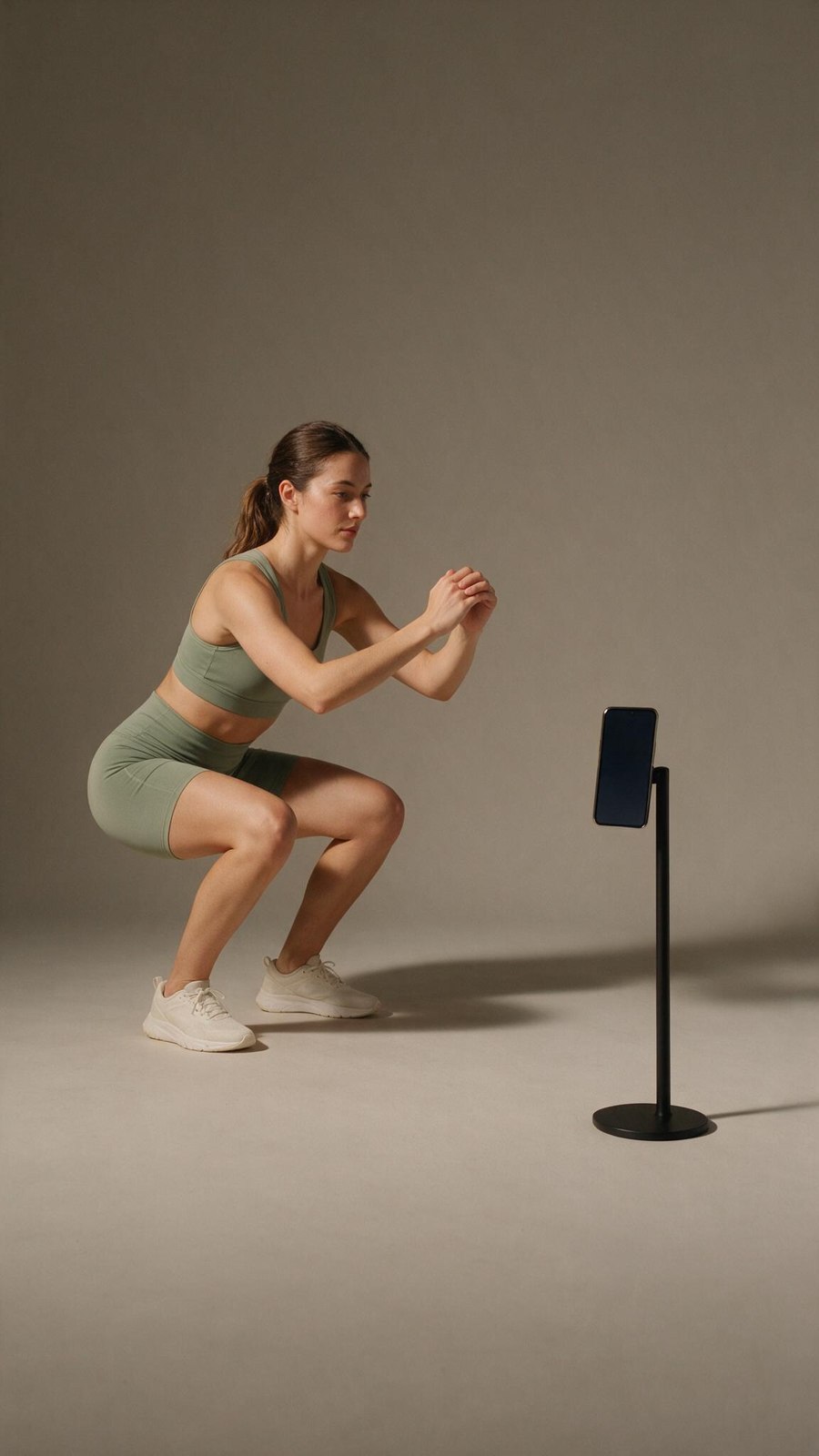
editorial-studio

editorial-studioBest plate

Diegetic — ready

The only frame here the UI can actually go inside. The phone is portrait, on a stand, all four screen corners clean and unoccluded, at a size that will read. Enormous quiet backdrop under the subject. Reads premium and brand-able; the risk is that it reads like a product shoot rather than someone's Tuesday.

prompt

Vertical 9:16 photograph. A woman in her twenties in a simple sage-green training set, mid-way through a bodyweight squat on a seamless warm-grey studio backdrop. Her phone stands on a slim matte-black stand about two metres away, facing her, the screen blank and dark and all four corners of the screen clearly visible. Large soft key light from camera left, subtle fill, one clean shadow on the backdrop. Controlled, product-forward, calm. Even warm-neutral grade, almost no colour cast, generous empty backdrop in the lower 40 percent of the frame. Shot on a 50mm lens at f/4, sharp throughout. Photorealistic studio photography, restrained and modern, not stock photography.

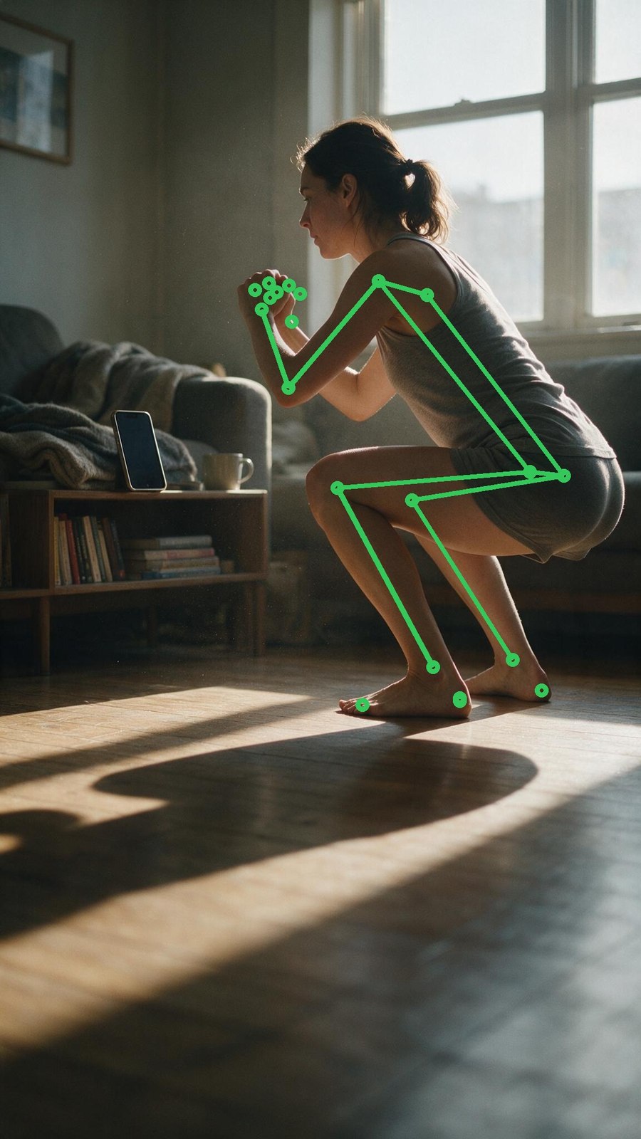
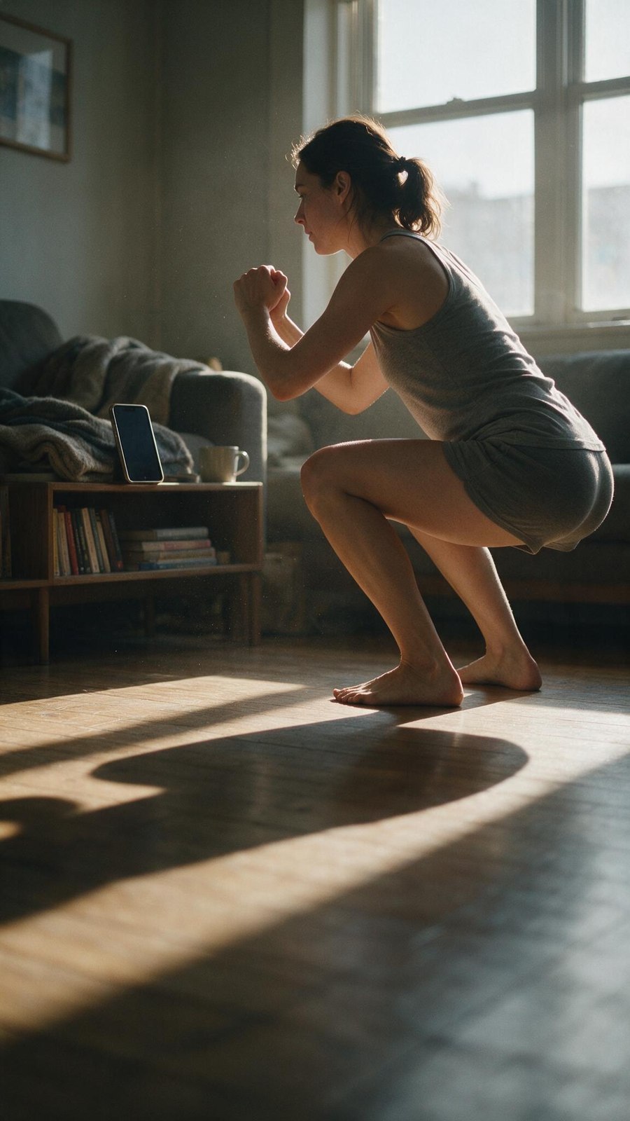
warm-domestic

warm-domesticPicked

Diegetic — confirmed working

The light is doing more work than anything else in the round — raking morning sun, real shadow, a room somebody lives in. This is the aspirational-but-real register Fitnit is actually pitching. And the phone is portrait, leaning on the shelf, screen dark, all four corners clean — I called it landscape on the first pass and that was wrong. It is small, but the comp test below proves the UI sits in it.

prompt

Vertical 9:16 photograph. A woman in her early thirties in a plain grey tank top and shorts, mid-way through a bodyweight squat on a wooden floor in a small apartment living room. Her phone is propped upright on a low bookshelf about two metres away, facing her, the screen blank and dark and all four corners of the screen clearly visible. Early morning, low warm sunlight raking in through a north-facing window, long soft shadows across the floor, dust in the air. Lived-in room: a folded blanket on the sofa arm, a mug on the shelf. Natural skin texture, visible pores, no retouching, no makeup gloss. Shot on a 35mm lens at f/2, subject in the upper two thirds of the frame, the lower 40 percent of the frame is empty floor and shadow with nothing competing for attention. Muted warm colour grade, gentle film contrast. Photorealistic, editorial, not stock photography.

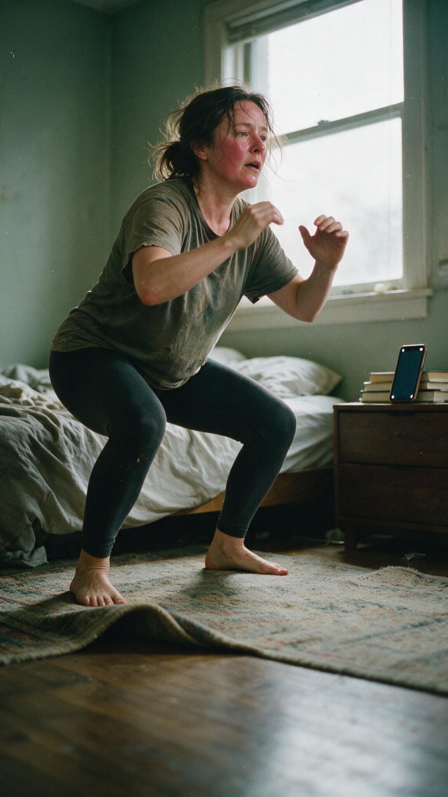
doc-grain

doc-grainMost honest

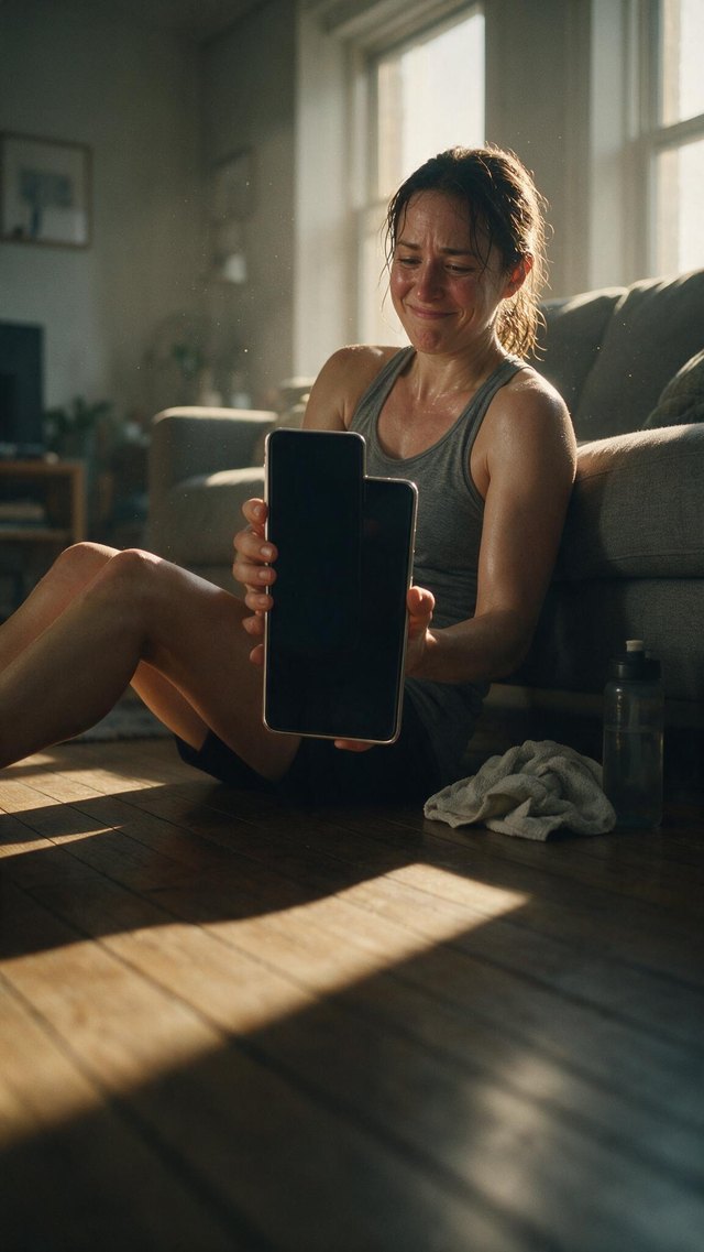
Floating card only

The least stock-looking frame by a distance, and the only one with a body that isn't a fitness model. Two problems: her face reads exhausted rather than in control, which is the wrong emotion for slide one, and the rug and bedding make the lower frame busier than type wants.

prompt

Vertical 9:16 photograph on 35mm film. A woman in her forties in a worn t-shirt and leggings, mid-way through a bodyweight squat in a cramped bedroom, rug pushed aside, bed unmade behind her. Her phone leans against a stack of books on the dresser about two metres away, facing her, the screen blank and dark and all four corners of the screen clearly visible. Overcast daylight from a single window, flat and honest, no fill. Real body, real effort, flushed face, hair coming loose. Visible film grain, slight halation on the window, imperfect focus. Candid and unposed, as if a friend took it. Subject in the upper two thirds, the lower 40 percent is quiet floor and rug. Kodak Portra palette, muted greens and browns. Photorealistic documentary photography, deliberately unglamorous, absolutely not stock photography.

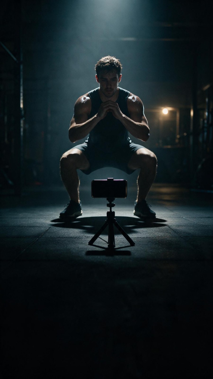
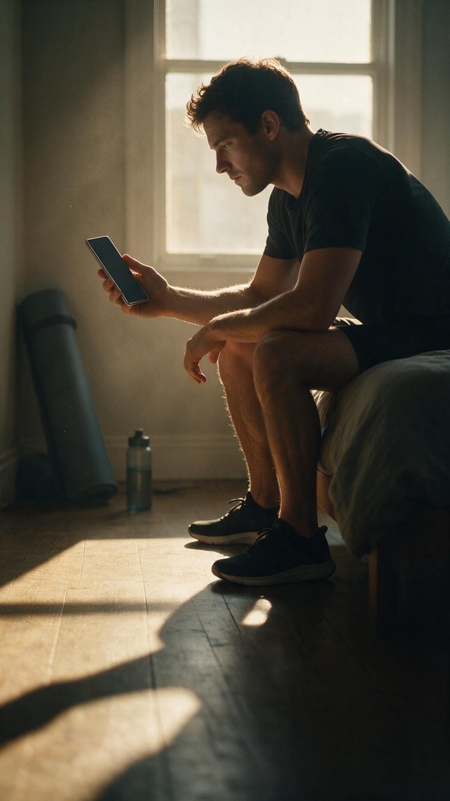
cool-gym

cool-gymWeakest plate

Neither

Handsome and off-brief. The phone is a dark silhouette far too small to carry UI, and the whole frame says hardcore gym at night when the product's pitch is your living room at 6am. Good negative space, wrong story.

prompt

Vertical 9:16 photograph. A man in his late twenties in a dark training top, mid-way through a bodyweight squat on rubber gym flooring in a dim, largely empty gym at night. His phone is clamped to a small tripod on the floor about two metres away, facing him, the screen blank and dark and all four corners of the screen clearly visible. Hard cool rim light from a single overhead source behind him, deep shadow filling the rest of the room, faint haze in the beam. Sweat on his shoulders. High contrast, crushed blacks, cool blue-grey grade with a single warm practical light far in the background. Shot on an 85mm lens at f/1.8, subject in the upper two thirds of the frame, the lower 40 percent falling off into near-black negative space. Photorealistic, cinematic, not stock photography.

Slide 1 — comp test

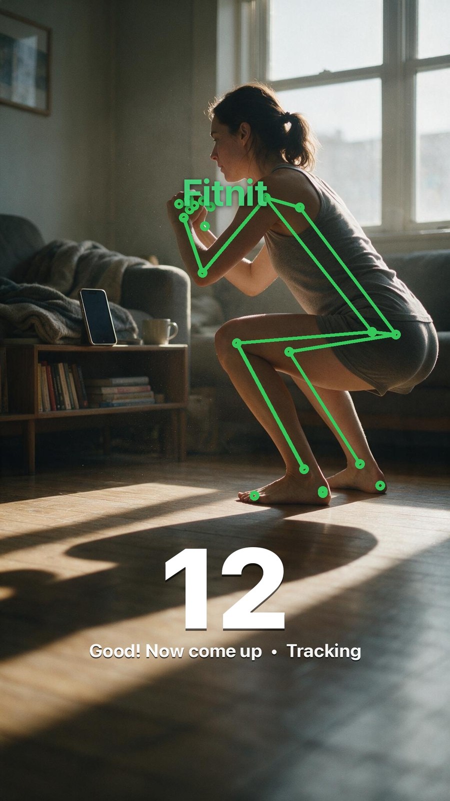
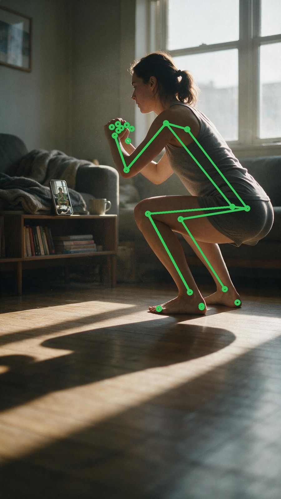
Real detection, not a drawing. MediaPipe Pose ran on the generated frames — 32 of 33 landmarks on the side view, 33 of 33 on the reverse — and the skeleton is drawn to ios/Fitnit/PoseCameraView.swift's own spec: connections (11,12)(11,23)(12,24)(23,24) for torso plus arms and legs, joints at radius 4, face landmarks 0–10 skipped, lineWidth 3 scaled from a 390pt phone up to the plate.

skeleton only
Athe pick. Skeleton only, exactly what the app draws, including the finger landmarks bunching at her hands and the far-side limbs estimated on top of the near ones, which is what MediaPipe does in profile.
real Fitnit HUD
E — the real HUD. 98pt weight-900 white numeral, bottom-centred, no panel behind it; phase line at 16pt/700; green Fitnit wordmark up top. The phase string is what a squat at the bottom genuinely produces.
final composite
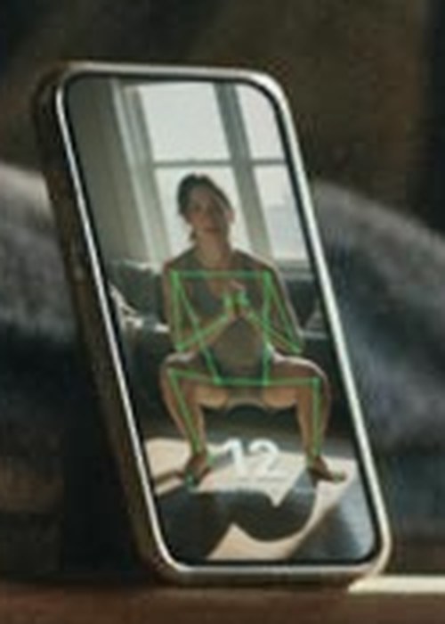
Gthe shot. Skeleton on her, no wordmark, and the phone showing what its camera actually sees: her front-on, skeletonised, with the HUD seated into the glass.

The HUD I invented first was wrong in every dimension. I drew a dark rounded pill with a green number and a “SQUAT” chip at top-left. The real thing in app/workout/[exercise].tsx has no panel at all: a 98pt weight-900 white numeral, bottom-centred, with a 16pt phase line under it. The number only turns #49DE80 when you pass a challenge target, and the exercise name lives in the top header, not a chip. Corrected in E and G.

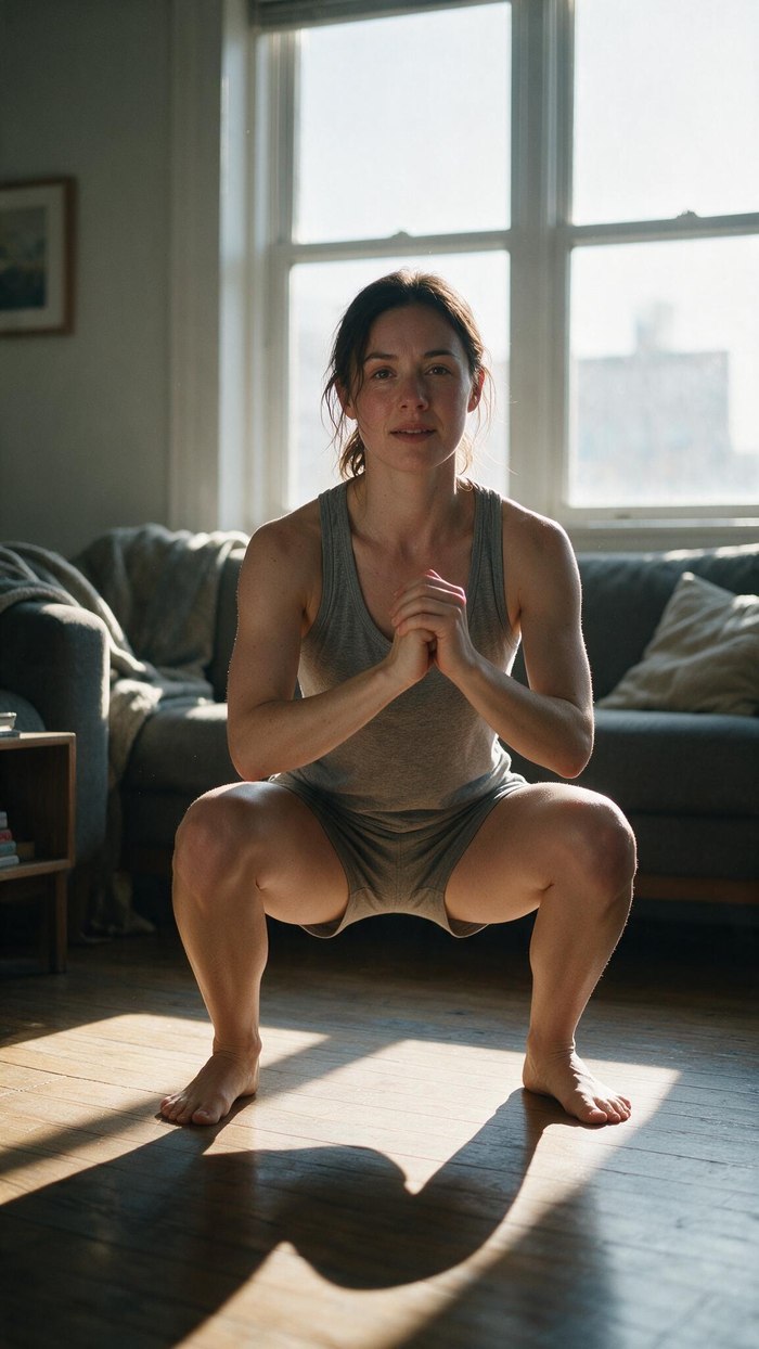
The first projection was a logic error. I warped the side-on room view onto the screen — but a phone propped facing her shows her front-on. Fixed with a Seedream edit of the same woman in the same room from the phone's position, 7¢, below. Identity, wardrobe, window, sofa and floor shadows all carried over.

The diegetic screen still cannot carry information. It is 63×120px in a 1152×2048 plate — roughly 22pt once this is a real phone screen. It reads convincingly as “she is on camera and being tracked”; you cannot read the numeral. Anything the viewer must actually read belongs on the plate, not in the phone.

The app's HUD and the slide's furniture want the same space. Both live bottom-centre. Lifting the rep block clear of the headline put it across her body and looked worse, so for the landing slide A is right — skeleton only, no HUD. Keep E for App Store screenshots, where the whole app frame is the subject.

A perspective warp alone still reads as a sticker. Five things seat it in the glass, and dropping any one puts the pasted look back: rounded corners built in source space then warped, so the radius follows the perspective; depth-of-field softening, because content sharper than the subject is the loudest tell; a grade down to ~0.9 brightness warmed toward the room; lifted blacks, since cover glass never lets screen black reach plate black; and a sheen from the window plus a little spill onto the room.

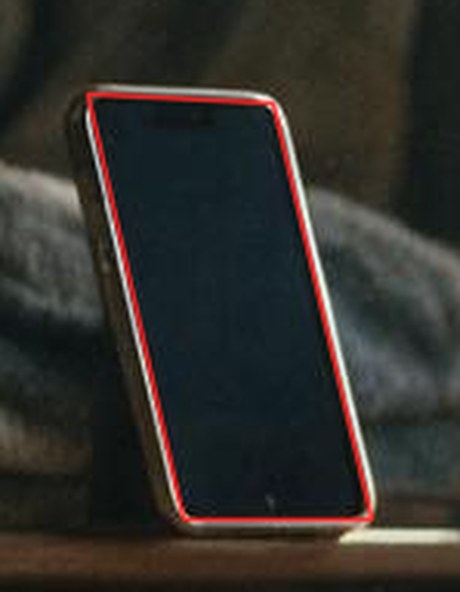
Getting the screen quad right took four attempts, and only the last one was a method. Eyeballing corners off a zoomed grid missed by 4–12px every time. Scanning luminance rows and columns for the bezel's inner edges was better but still wrong, because specular highlights on the bezel and on the shelf drag the line fits outward. What actually works is segmentation: the screen is dark and ringed by the brightest thing in the crop, so threshold the bright bezel, convex-hull its largest component to get the phone silhouette, and take the dark hole inside. Thresholding darkness directly fails outright — the screen merges with the dark sofa behind it.

Then the contour's corners are still not the corners. A phone screen is a rounded rectangle, so its polygon approximation lands points on the arc, inset from where the straight edges would actually meet. Assigning contour points to the four edges, discarding everything within 22% of a corner, fitting each edge by total least squares and intersecting adjacent pairs recovers the sharp quad — which is exactly what a perspective warp plus a rounded-rect alpha wants. measure_screen.py --check draws the result back onto the untouched plate; look at that before trusting any numbers.

Two traps in PIL's perspective transform, one build each. It point-samples, so letting it do a 3× reduction stairsteps every edge — downscale to the screen's true pixel size with LANCZOS first, then warp 1:1. And it returns nothing past the source's last pixel, which lands a hard aliased boundary exactly on the edge no matter how clean the mask is; pulling the alpha in by one pixel puts that boundary where the mask is already transparent.

The wordmark is gone. Right call — someone looking at onboarding already knows whose app they downloaded. fitnit_hud.py takes show_logo=False; it stays on for App Store screenshots, which get seen out of context.

Profile poses muddle the skeleton. Side-on, the far arm and leg are estimated roughly on top of the near ones — that is the arrow shape through her torso. The reverse angle scored 33/33 and reads cleanly, which says a three-quarter stance is worth asking for in round two.
reverse angle plate
The reverse angle — a Seedream v5/pro/edit of the plate, prompted as the view from the phone on the bookshelf.
phone screen at 4x
G, phone at 4×. Content now reaches the bezel on all four sides; rounded corners built in source space and warped so the radius follows the perspective.
fitted quad drawn on the plate
The fitted quad drawn back onto the untouched plate — the proof that produced it. Corners sit just past the visible rounded arc, which is what a sharp quad plus a rounded-rect alpha wants.

Slide 2 — nutrition

7 frames · $0.48

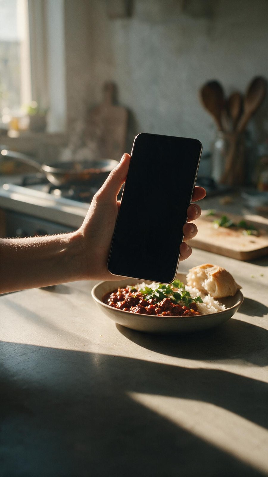
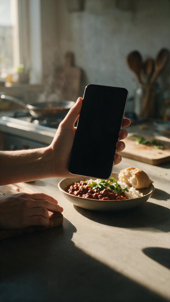
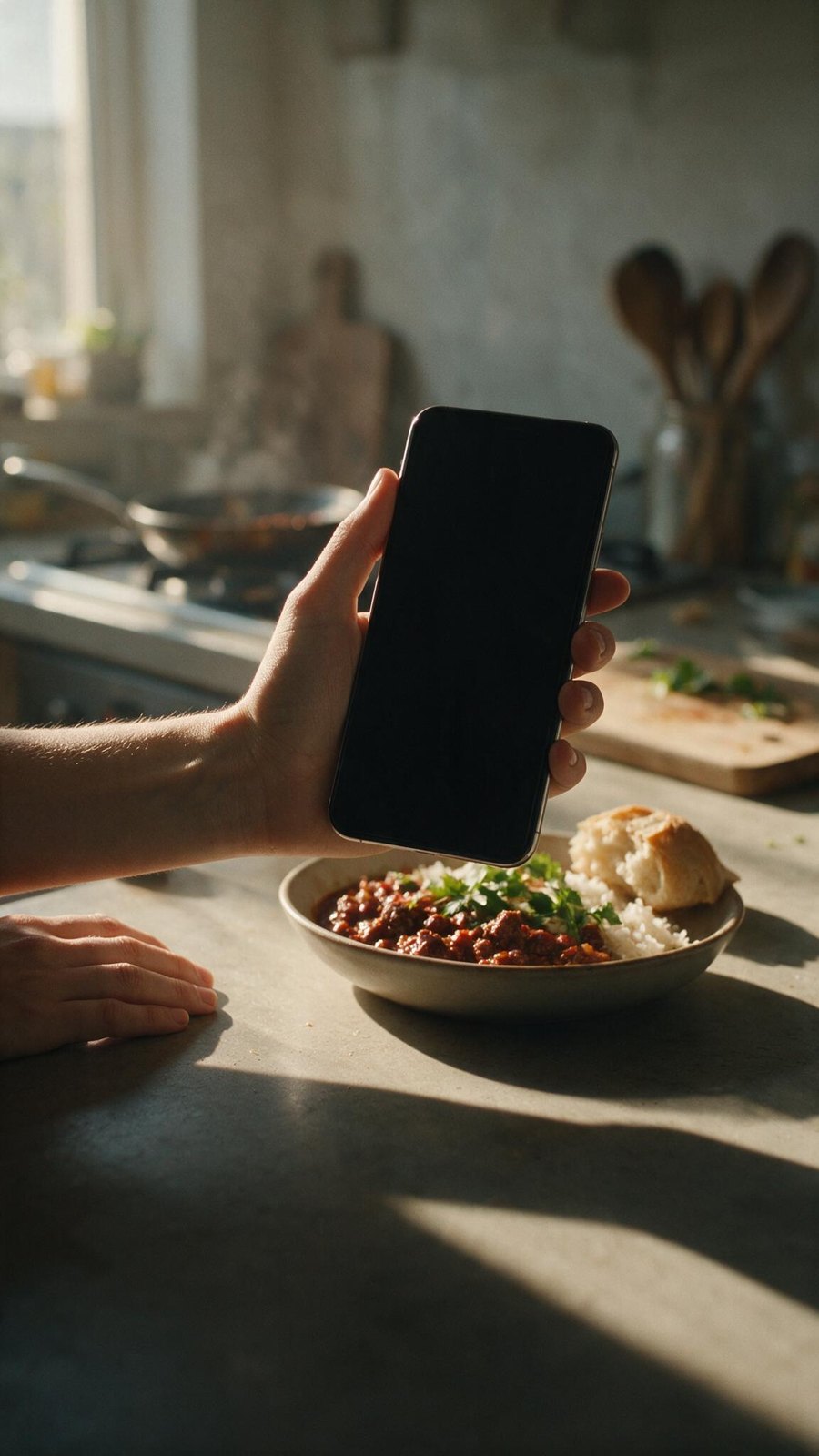
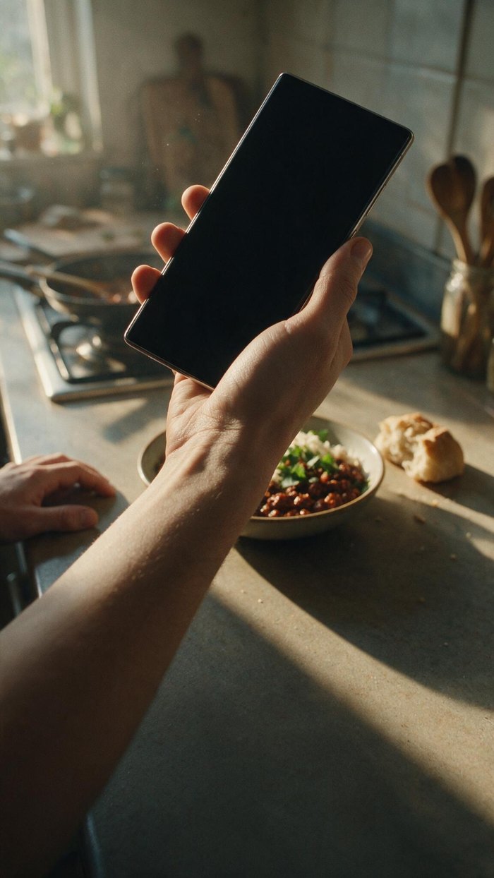
Two compositions tested against slide 1's locked light and grade: an overhead plate-and-phone, and a first-person POV as if seen from the person's own eyes. POV wins, and the reason is measurable — it is the only way to get the phone large enough in frame that the food-scanning UI can actually be read, which is the exact wall slide 1 hit.

B-pov-3, second hand removed

B-pov-3-nohandPICK

second hand removed · 7¢

The one to build on. A v5/pro/edit pass took the flat second hand off the counter and continued the surface and its shadow underneath — everything else held: same phone position, same blank screen with four clean corners, same bowl, same light. The lower 40% is now genuinely empty, which is exactly what the headline and CTA need.

B-pov-3, hand on the board

B-pov-3-hand2Alternative

hand repositioned

Same edit, but the second hand moved onto the cutting board so it reads as steadying rather than lying there. More purposeful, and it works — but it puts clutter back into the one part of the frame the type has to live in. Keep it if the empty counter feels too bare.

B-pov-3

B-pov-3Original

33% of frame width

The plate both edits come from, and the reason this composition wins: the screen is ~377px wide in a 1152px frame — 33%, against slide 1's 5.2%. Six times bigger, which is the difference between a lit green rectangle and UI you can actually read. The flat second hand at lower left was the only thing wrong with it.

B-pov-2

B-pov-2Runner-up

biggest screen, wrong angle

The largest screen of the five, and unusable for it: the phone is tilted about 35°, so any UI composited on would read as skewed rather than held. The food is incidental, pushed small and left, and the forearm runs diagonally through the lower third where the headline goes.

B-pov-1

B-pov-1Weak POV

food too far

Reads as POV and the phone is portrait with a clean screen, but the bowl is small and distant, so the slide stops being about food. The lower left falls away into a dark void that the counter in the other POV frames fills much better.

A-overhead-1

A-overhead-1Best lower third

~13% of frame width

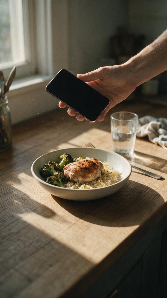
The calmest composition here and the cleanest space for the headline and CTA. Chicken, broccoli and rice reads healthy without being staged. The problem is the screen: about 13% of frame width — better than slide 1, still too small to carry anything readable.

A-overhead-2

A-overhead-2Off-grade

brightest, least matched

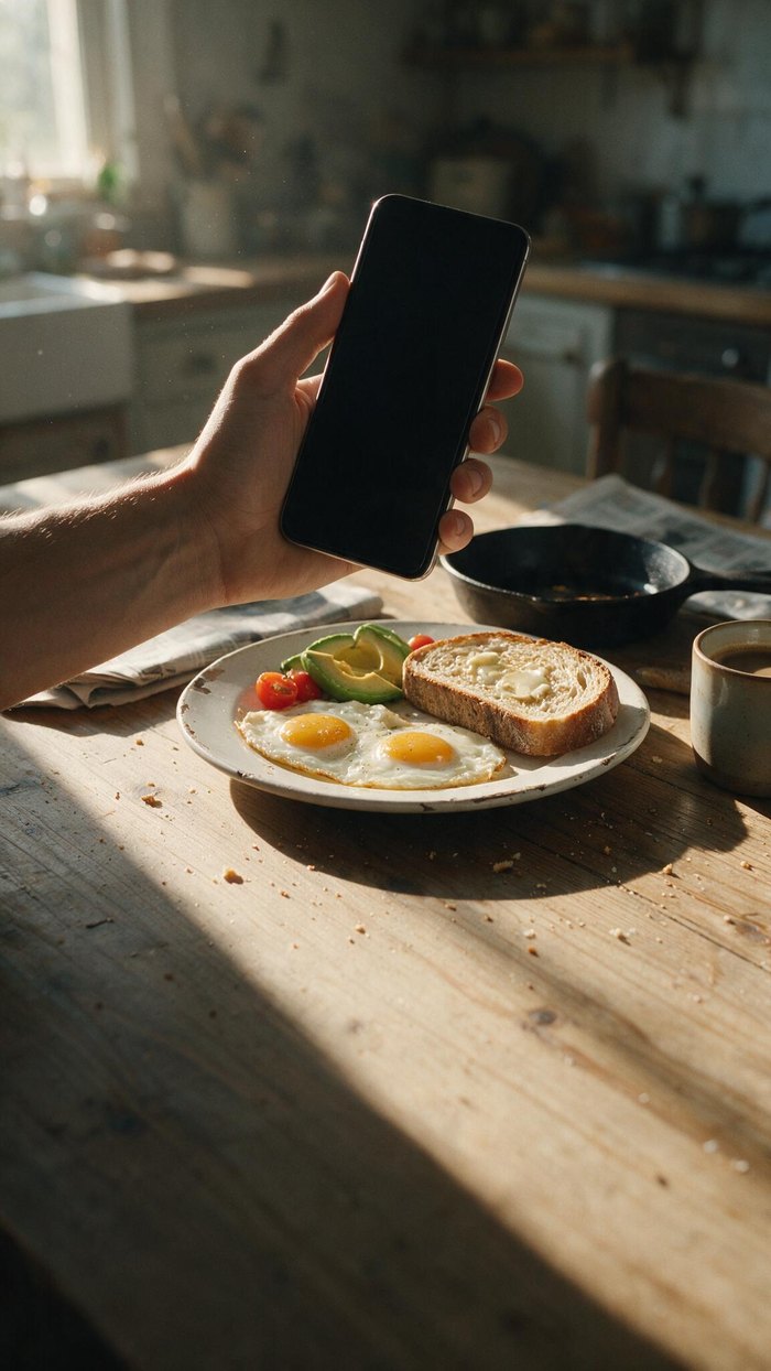
Warmer and brighter than slide 1's grade, which breaks the set — three slides have to look like one app. The phone is small and angled away, and the breakfast plate reads more café than home kitchen. Weakest of the five.

Still to decide before compositing. The bowl sits roughly 61–70% down the frame and the landing scrim starts around 52%, so the headline lands across its lower half. Shifting the crop up fixes it for free; regenerating with the food higher costs 7¢.

The screen quad on this plate is not dialled in yet. measure_screen.py reaches 0.92 rectness via the dark-slab route — the bright kitchen breaks the bezel-ring assumption that works on slide 1 — but the fitted corners are still a few pixels out. At 290px wide that is under 3% error against slide 1's 20%, so it is close; it will still need a dial-in pass before the UI goes on.

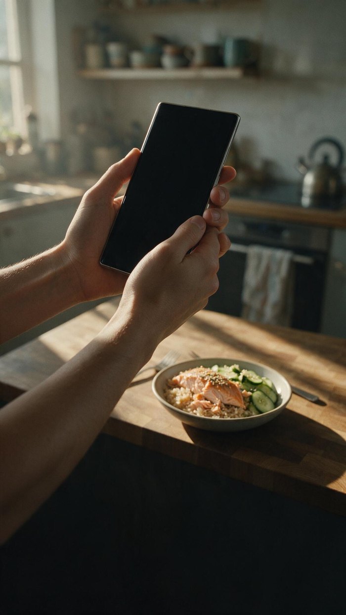
Hands came out right on all five, which is not what I expected — it is the classic failure mode for this composition. Naming it explicitly in the prompt appears to be enough.

Screen sizes, for the record. Slide 1: 5.2% of frame width. Overhead: ~13%. POV: 27–33%. Anything the viewer has to read needs the third of those.

Slide 2 — comp

real scan UI on the plate

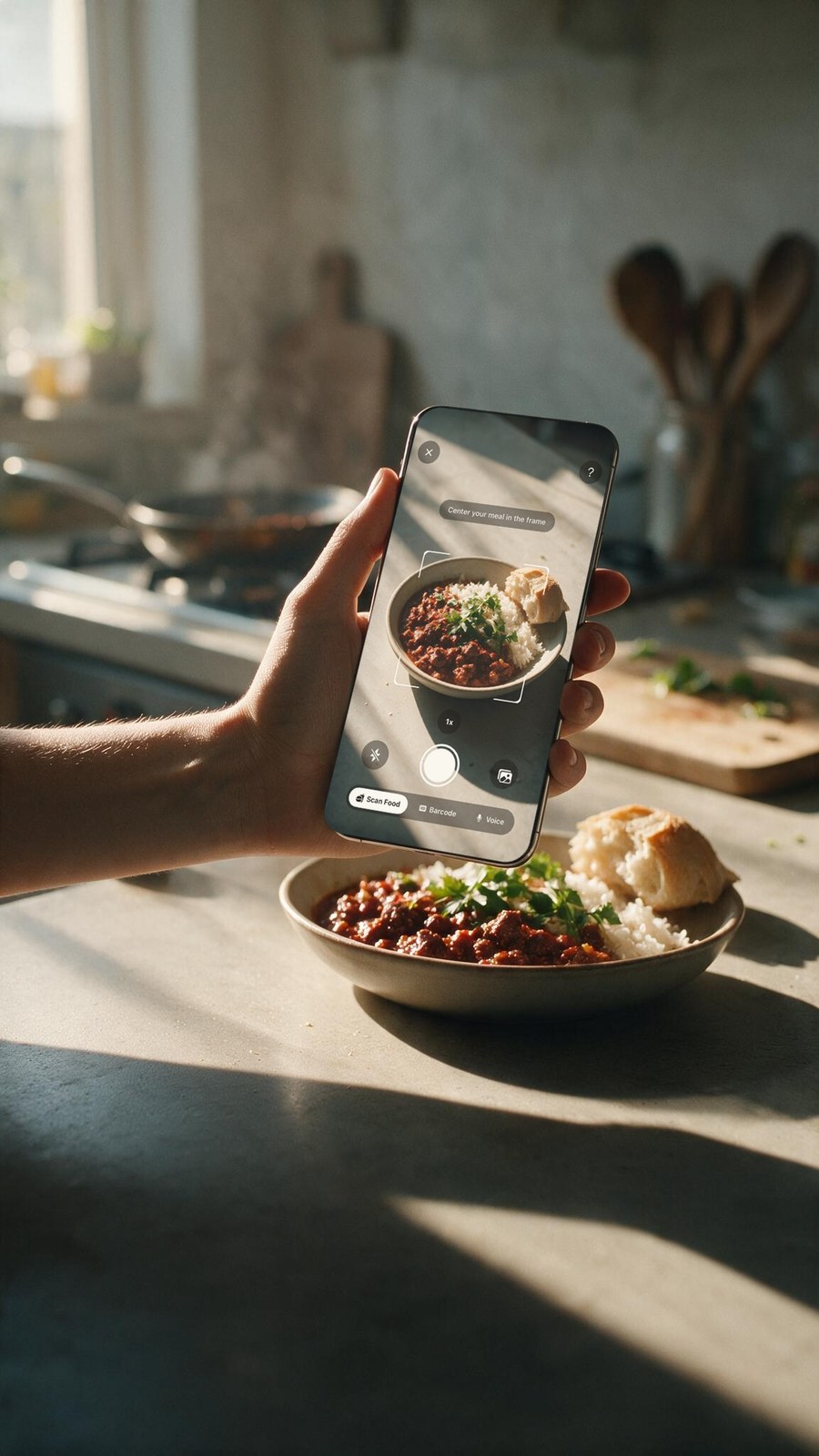
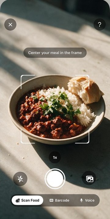
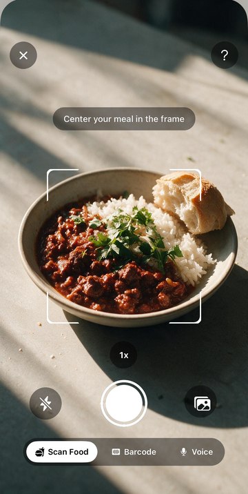
The chrome is app/nutrition/scan.tsx rebuilt as a real RGBA overlay — X and help, “Center your meal in the frame”, the corner-bracket frame, the 1× pill, flash, shutter, library, and the Scan Food / Barcode / Voice mode bar. Geometry measured off a simulator capture; pill backgrounds redrawn from the screen's own style values; only the white glyphs keyed.

slide 2 composite
slide2-final — the phone showing Fitnit's scan UI aimed at the bowl that is sitting right there on the counter.
phone at 4x
Phone at 4×. The UI is legible at real size — which was the entire argument for POV over the wide shot.
captured chrome
The rebuilt overlay proved over a bright background before warping. A mistake here is invisible over black, which is how the first attempt shipped broken.
assembled screen
The assembled screen before warping: a generated close view of the same bowl behind the real chrome.

A shadowed parameter put a 16% green wash over the whole screen. place_on_screen gained a spill argument so the light leaking out of the screen could be tinted to whatever the screen shows — but the function already had a local variable of the same name, so the caller's warm value was silently ignored and slide 1's green kept firing. It looked like a colour-grading problem and was not one. A control test — warp a flat (200,60,40) patch and check what comes out the other side — found it in one shot: (188,84,60), exactly a 16% green overlay. That test is worth keeping; eyeballing had me chasing the grade, the sheen and the depth-of-field pass for several rounds.

I composited the wrong screen first, and that turned out to be a real finding. scan-camera.tsx was the older barcode-only camera; the one the “+” menu opens is scan.tsx. Both existed, which is why it was easy to grab the wrong one — so both old cameras are now deleted and the unified scanner is the only one. See below.

A keyed screenshot cannot be an overlay here, and the first two attempts both failed on it. Every control sits on CONTROL_BG = 'rgba(0,0,0,0.45)', so over a black feed the pill backgrounds render as literal black — key the feed out and they go with it, leaving white glyphs floating on the food. A device capture does not rescue it either: real sensor noise in the dark feed (luminance 3–18) overlaps the pill greys, so no threshold separates chrome from feed. The overlay had to be rebuilt: locate every control by connected components on the white mask, redraw the pills from the screen's own style values at @3x, key only the glyphs, and lift the opaque white Scan Food chip wholesale so keying does not drop its black label.

Restoring the pill backgrounds also fixed legibility. White 14pt type on a bright bowl is unreadable at a 4× reduction; the same type on its own rgba(0,0,0,0.45) pill survives, because the pill is a large solid shape rather than thin strokes. “Center your meal in the frame” reads now. That was not a resolution problem after all — it was the missing backgrounds.

Four wrong quads, and the cause was not the fitting. Every attempt read corners off a --check proof by eye and each was wrong in a different way: 4–12px out, then too narrow, then about 60px short vertically, which is the version with visible gaps top and bottom. The missing piece was a number. fit_quad.py now builds a mask of the dark glass and scores any candidate on the two things that actually go wrong — coverage (how much glass the warp fills) and spill (how much lands on bezel or fingers) — then coordinate-descends the corners against it.

The scoreboard settles it, and not in my favour. My eyeballed quad: 87.2% coverage. The one measure_screen.py had produced automatically, which I overrode because a proof image looked wrong to me: 98.5% / 1.1% spill. Optimising from there lands at 98.3% coverage, 0.9% spill, aspect 0.462 against a real iPhone screen's 0.461. The tool had been right and I replaced it with a guess — four times.

Slide 3 — social

4 plates · $0.41

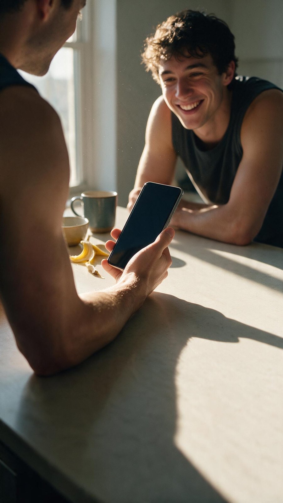
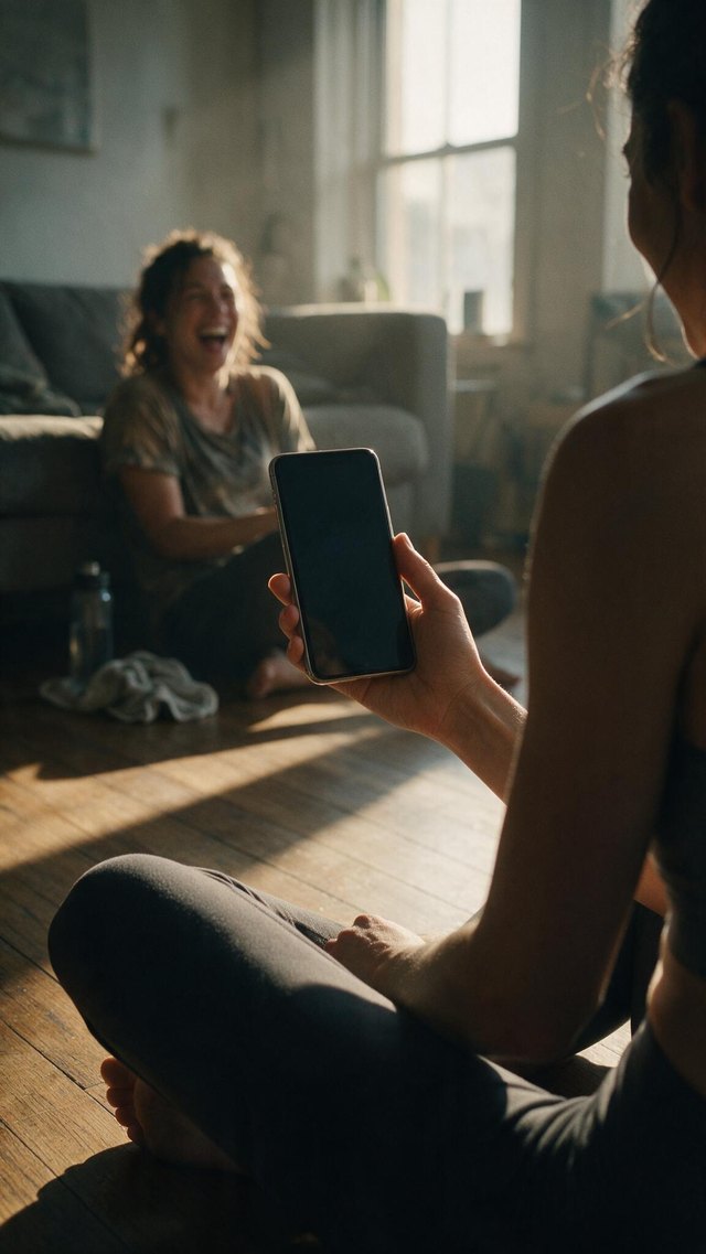
“Stay accountable with friends”. Two compositions against slide 1's locked light: an over-the-shoulder two-shot, and a solo fallback carrying the social signal entirely on screen. The two-shot wins — it completes the wide → close → medium scale rhythm, and it puts only one face in the render rather than betting the shot on two.

A-shoulder-2

A-shoulder-2PICK

over-the-shoulder · thumb + reflection fixed

Completes the scale rhythm — wide room, close POV, now a medium two-shot — and it is the only slide with a second person in it. A genuine grin, a natural hand, warm morning light matching slides 1 and 2, and a long shadow across a clean counter exactly where the headline goes. Two 7¢ edits: the thumb was lying across the glass, and the screen carried a window reflection.

A-shoulder-1

A-shoulder-1Right idea

friend's expression fails

Same composition in the living room and the staging works — foreground shoulder and phone, friend across the room. But her face reads distressed rather than laughing, which is the one thing this slide cannot get wrong. The foreground hair intruding at the top does not help.

B-solo-1

B-solo-1Fallback

no second person

The safer composition: solo, post-workout, “friends” carried entirely by the leaderboard on screen. The phone is large and clean. Her expression reads pained rather than amused, though, and without a second person the slide is noticeably colder than the two-shot.

B-solo-2

B-solo-2Weakest

phone too small

Calm and nicely lit, and useless for this slide: the phone is about 7% of frame width, far too small for a leaderboard to read, and there is no social signal at all. It is a picture of a man resting.

The leaderboard is the right screen, and I checked before choosing. social/challenges.tsx is a list of cards with small descriptive text — at ~250px of screen it becomes mush. social/leaderboard.tsx does not: avatars, medals and big green rep numbers. Rows of faces beside large numbers still read as “people, ranked” when you cannot parse a word, which is the whole message. Its light theme is a bonus — a bright screen against warm shadow reads as unmistakably on, and contrasts with slide 2's dark camera UI so the three do not feel samey.

The screen on this plate does not want to be measured, and I stopped rather than guess. Three routes tried and each rejected on its number: dark-slab finds only a third of the glass because it carries a window reflection; bezel-ring scores 0.63 rectness because the bezel is thin and blown out; fitting the phone body fails because it merges with his dark top. A 7¢ edit flattening the screen to matte black helped the image but not yet the fit. Left unsolved deliberately — the honest options are a better-scoring seed, or regenerating with the phone flatter to camera.

Code change — one scanner

2 files deleted · verified

Compositing the wrong screen surfaced a real problem: Fitnit shipped three nutrition camera entry points. That is now one.

Deleted app/nutrition/camera.tsx (574 lines) and app/nutrition/scan-camera.tsx (447 lines). Both were reachable, barely. camera.tsx was the old chooser, entered only from analysis.tsx's “Try Again” button after a failed analysis — so the one moment a user was already frustrated dropped them into a different camera from the one they started in. scan-camera.tsx, the barcode-only camera, hung off that. Both Stack.Screen registrations removed from _layout.tsx.

Two references repointed to /nutrition/scan: analysis.tsx:505 (Try Again) and manual.tsx:71 (post-signup returnTo).

Verified: tsc --noEmit clean; check-layout-gutter 9/9 conform; probe-deep-links 20/20 no crash; console clean against the known RevenueCat baseline. On a relaunched simulator fitnitios://nutrition/scan opens correctly and the dead fitnitios://nutrition/camera degrades to “Entry not found” rather than crashing.

Nothing else scans. Swept every surface touching a camera: scan.tsx is now the only food scanner. What is left is unrelated and stays — profile photo capture in (onboarding)/photo.tsx and settings/edit-profile.tsx, and NativePoseCamera for workouts.

One consequence needing a decision. direct-entry.tsx — manual entry with exact macro values and autosuggest — was reachable only from the chooser, so it is now orphaned. The file is still registered and intact; it just has no way in. The “+” menu already carries Scan food, Food database and AI describe, so adding it there is the obvious home, but that is a product call rather than a cleanup. Separately, the unified scanner defaults mealType to 'lunch' where the old chooser asked up front — pre-existing for anyone entering from the “+” menu, but now it is the only path.

Two things the prompts got wrong

Flip Slide furniture above to drop the real landing.tsx headline, body, dots and Get Started button onto each frame at true proportions. That is the actual test: the lower 40% has to stay quiet enough for type to sit on it.

One caveat on that overlay — the white scrim behind the type is a proposal, not current code. Today landing.tsx sets a flat #ffffff background and near-black text, which needs no scrim because there is no photograph. Put a photograph behind it and something like this gradient becomes necessary, so the overlay shows the treatment these frames would actually ship into rather than the one that exists.

Nothing is animated yet. Video costs 4–10× a still, so the next spend waits on a locked style.

.claude/skills/fal-broll/            the skill
.asc/broll/round1/                   these four, full resolution
python3 scripts/still.py   --brief references/briefs/style-round.json --out …
python3 scripts/animate.py --image <approved>.jpg --motion "…" --dry-run