Fitnit · proposals · 2026-09-07
What's next
Seven changes, each shown against the screen it actually replaces. The left pane in every pair is a real screenshot or a real fact about the code as it stands today; the right pane is the proposal. Nothing here is built yet — this board exists so the argument can be had before the work, not after.
src/theme/tokens.ts and
ThemeContext.tsx, exported to
app-tokens.css by a script in the app repo — so a
mock uses the real 14pt card corner, the real 16pt gutter and the real
#49DE80, and goes stale when they change rather than quietly staying wrong.
Mocks and screenshots are both shown at 402pt, the iPhone 17's true logical width, so a
pair is always at one scale. The home-screen proposal is held to the full 874pt frame:
it fits in one screen because it measures 874, not because the mock was cropped to its
own content.
src/lib/referral/referralLink.ts), and
the push-permission screen already exists — it is just the tenth of eleven onboarding
steps. Those two are placement problems, not build problems, and they are the cheapest
things on this page.
Kill the carousel, keep the charts
The first draft of this compacted every widget to a label and a number, which threw away the weight chart, the calorie ring and the step history — the parts people actually look at. The problem was never the widgets. It was the three horizontal carousels they are hidden inside.
The store already has WidgetSize — small, medium, large — and it
is already respected. So the fix is not to shrink anything: it is to lay the existing
sizes out in one vertical grid, the way iOS lays out home-screen widgets, and delete the
section/carousel machinery on top.
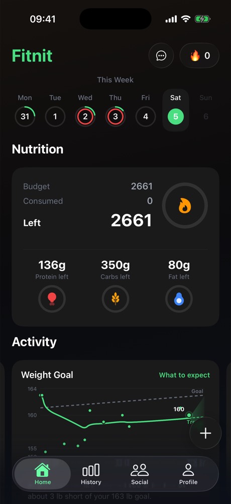
Before · top of the screen
Before · scrolled to the end
After · one grid, charts intact
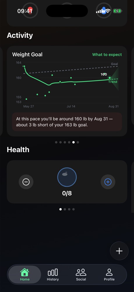
Count the page dots in the middle frame. Activity is six pages, Health is four — each rendering exactly one widget at a time. Twelve widgets exist; three are on screen. The other nine need a sideways swipe nobody makes, and the screen still ends in dead space.
The carousel also costs the widgets their size. Everything in a pager has to be the same height, which is why the water widget — a number and two buttons — occupies as much of the screen as the weight chart does.
Nothing is removed and nothing is flattened. The calorie ring, the weight chart with its projection cone, the step week, the move ring, the sleep stages, the month heat grid and the water steppers are all still here — laid out at the sizes the store already stores, instead of one per page.
Small widgets get to be small, which is the part the carousel made impossible. Nine widgets in 1,001pt — 1.15 screen-heights of ordinary vertical scroll, against three screen-heights plus ten horizontal swipes. Reordering moves to Settings, where a preference belongs.
userStore carries
WidgetSection, createSection, renameSection,
deleteSection, reorderSections and
moveWidgetToSection, plus WIDGET_DEFAULT_SECTION and a
persisted-state migration. All of it is dead once sections go, and the store is
persisted — so removing it needs a migration that survives an old install, not just
a delete. Existing users' arrangements will be discarded. That is a product
decision, and it should be made deliberately.
A ring that says Premium
A visible status marker on subscribers' avatars, everywhere an avatar renders — feed, comments, leaderboard, messages, friend list, profile header.
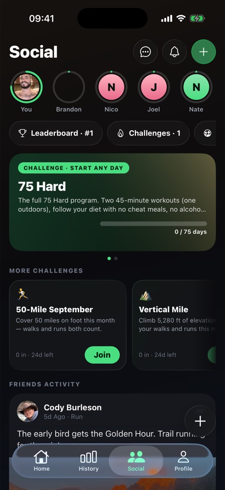
The green ring already means something. On the Social tab it marks a friend who has posted — the story-ring convention. A premium ring cannot be green, and cannot be a plain ring, or the two read as the same badge.
A gradient arc, not a flat stroke — it has to survive a 40pt row.
One shared <Avatar> component takes
isPremium and hasPosted and resolves the ring itself, so
fourteen call sites cannot drift. Both states at once: gold ring, green dot.
apple_subscriptions, written by the RevenueCat webhook and (correctly)
RLS'd so nobody reads anyone else's billing row. A ring needs a public
profiles.is_premium boolean, maintained by a trigger on
apple_subscriptions so it can never be forged client-side — the same shape
as the notifications inbox, which has no insert policy for exactly this reason. Ship the
trigger and the backfill first; the ring is an afternoon after that.
Physique scan — the first thing Fitnit sells that isn't a subscription
A photo goes in, a scored breakdown comes out: an overall number, a potential number, and a score per area. One free scan during onboarding, then $1.99 a scan after that. A second product — Future You, an AI render of the same body at its potential — sells for more, because it is the thing people actually want to see and the thing they will post.
This is the strategic point of the feature, not a side effect: every dollar Fitnit earns today depends on someone keeping a subscription. A one-off unlocks the people who will never subscribe, and it monetises the moment of highest intent — the day someone installs a fitness app and photographs themselves.
An estimate from one photo. Not a medical or body-composition measurement.
Core at 69 is the whole product. A single overall number is a verdict; six areas plus a potential score is a to-do list, and a reason to come back and scan again to watch one of them move. Share Results is the growth loop — it is a card people post, and it carries the sharer's referral link like every other share does.
- Roughly 9 months at your current rate
- Core and chest are the two furthest from potential
- About 12 lb of lean mass, 4 lb of fat
An illustration of a goal, not a prediction or a promise of results.
Price it above the scan and sell it off the scan's own result. The scan produces the number and names the gap; Future You is the answer to the question the number just raised, offered at the one moment the person is definitely thinking about it. It is also the more shareable artefact of the two, which is what justifies the render cost.
Most of the pipeline. analyze-nutrition is already a
server-side Gemini call behind a JWT with a quota; the food-photo path already does
capture, crop, private-bucket upload and signed reads; Sensitive Content Analysis is
already wired for screening user photos. A scan is that pipeline with a different
prompt and a different result screen.
Two things do not exist. Fitnit has never sold a one-off.
PRODUCT_IDS holds three subscriptions and nothing else, and
useSubscription reads entitlements.active — which
consumables never appear in. And there is no image generation anywhere in the
app; every AI call so far reads, it does not draw.
A credits ledger, server-side. Consumables are not an
entitlement — buying one leaves nothing on the customer record to read back. So the
purchase has to be validated by a RevenueCat webhook (the handler already exists for
subscriptions) and written to a scan_credits table the client spends
against. Never trust a client-side purchase result for something that costs money to
serve.
The free onboarding scan is the acquisition mechanic, so it has to be free of an account too — it lands before signup, which means the credit is granted to the device and reconciled when the account appears. That is the same problem the referral link already solves, and the same answer: grant it locally, attach it on sign-in.
Meal plans the coach can hand you, and you can keep
The coach already proposes structured things and renders them as cards — that machinery is built and guarded. Meals are a new block type in it, not a new system, and the block is the same object whether it came from one ingredient, a photo of a fridge, or a whole week's plan.
1 · From a photo of what you have. The nutrition scanner already sends a photo to Gemini and gets structured food back. Pointing the same path at a fridge instead of a plate is a prompt change, and the answer is the same meal block — loggable, saveable, priced against the real food database.
- Breakfast — Greek yoghurt, berries, granola · 430 cal · 32g P
- Lunch — Chicken burrito bowl · 528 cal · 46g P
- Snack — Protein shake, banana · 310 cal · 28g P
- Dinner — Salmon, potatoes, broccoli · 742 cal · 44g P
- Evening — Cottage cheese, honey · 634 cal · 12g P
2 · A day built to hit your actual targets, which the coach
already knows — it is grounded in your goals and your logged history, and
check-coach-context.ts exists to stop it inventing either.
3 · Edit it in conversation. "200 lighter", "no dairy", "I hate salmon" — the
plan is an object, so it can be revised rather than regenerated.
4 · A week becomes a grocery list. Seven saved days deduplicated into one list is the same data with a different reducer, and it is the thing that makes someone open the app in a supermarket.
Save writes to a saved_meals table and the meal
reappears in the food scanner's saved list — a surface that was already wanted and
has nothing to fill it. That is what makes this more than a chat trick: a meal
invented once on a Tuesday is a one-tap log every Tuesday after.
It also feeds the sharing work below. A saved meal is exactly the object item 05 wants to share — photo, macros, ingredients — so building it here means that share has something real to point at.
Every number in a meal card is resolved against the real food
database before the card renders. The model proposes foods and portions; it does
not get to state calories. check-coach-actions.ts already enforces the
harder version of this on the logging path — a model-proposed calorie figure is
dropped, not clamped — and a meal block inherits it.
check-coach-blocks.ts already stops raw JSON leaking
into a chat bubble and stops a plan mislabelled log from writing a
workout nobody did. A new block type is covered by both from day one, which
is the argument for making meals a block rather than a feature beside the coach.
Sharing that already pays — it's just hidden
The affiliate half is done and earning: referralLink.ts caches the
sharer's Affiliateo link at startup so it is available synchronously the instant a share
sheet opens, and ShareCardModal appends it plus a scannable QR sticker.
The problem is that almost nothing in the app opens that sheet, and the link it carries
lands on a page that says nothing about what was shared.
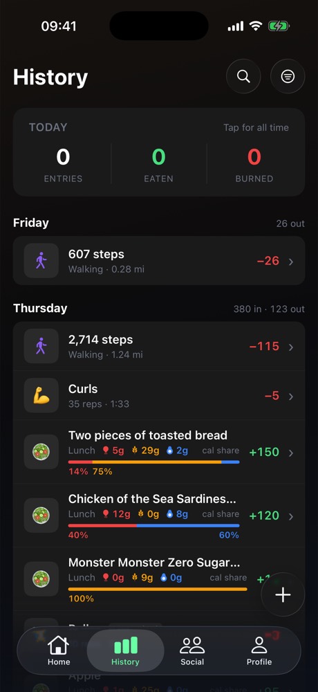
Before · a week of history
After · share, from the row
fitnitapp.com/r/caden · appended automatically, every time
After · the moments with no button
- A workout you built — sets, muscles, a real URL
- A personal record the moment it lands
- A finished challenge, with the number
- A physique scan result
Every one of these already has the referral plumbing. None of them has a button.
And the part that compounds: a shared workout needs somewhere to land. Today the link goes to a generic App Store page, so a stranger sees nothing of what was shared. A real page turns every user-built workout into a page Fitnit owns, carrying its author's code.
Pull Day 5×5
Built by Caden · 1,240 people have run it · 48 min
| Exercise | Sets | Target |
|---|---|---|
| Deadlift | 5 × 5 | Posterior chain |
| Pull-up | 4 × 8 | Lats, biceps |
| Barbell row | 4 × 8 | Mid back |
| Face pull | 3 × 15 | Rear delts |
| Barbell curl | 3 × 10 | Biceps |
<title>Pull Day 5×5 — a back and biceps workout | Fitnit</title>
schema.org/ExercisePlan · indexable · ?r= carries the author's commission
ShareCardModal is reachable from exactly three
screens — social/compose, history/workout/[id],
history/activity/[id]. The History screenshot on the left is a normal
week: steps, a workout, four meals. Not one of those rows offers a share, and
the two detail screens that do require you to already be inside them.
What it produces is a still image, and the link it carries resolves to the App Store. A stranger who taps it sees Fitnit's listing, not the run they were shown.
Video first. A still of a run gets scrolled past and a 12-second replay does not. It is the only one of these that changes how far a share travels, and the route, splits and pace are already on the summary screen — this is an export format, not new data.
Then a share button on every row that has something to show. The plumbing is done; what is missing is the affordance, in about a dozen places.
Then the page. User-built workouts are the SEO surface
Fitnit does not have, and the exercise library already proves the pattern of a page
that grows itself. Every page carries its author's ?r=, so the
incentive to build and share one is real money rather than vanity.
A challenge you can lose
Challenges are already prominent — the Social tab leads with them. What is missing is the loop: nobody is told when they are beaten, and there is no way to answer.
The surface is fine. 75 Hard leads, a carousel offers more, and the onboarding push screen already promises "when a friend beats your number." That promise is not kept — no trigger sends it. These are month-long solo grinds against a progress bar; you can go 24 days without a single reason to open the tab.
Being beaten is the notification worth sending, and the rematch has to be one tap from it — a new challenge pre-loaded with the number to beat. That is the whole loop, and it is what turns a progress bar into a rivalry. Head-to-head against one friend, not a 75-day program, is the format that actually produces a loser.
actor_id → profiles foreign key the existing ones use, or the PostgREST
embed silently returns nothing. There is a check for this:
check-notifications-rls.py.
Ask for push before they can leave
The screen exists and is well-written. It is the tenth of eleven steps — so the people most likely to abandon onboarding are exactly the people we never got permission to reach.
Nine screens of questions stand between opening the app and the permission prompt. Everyone who quits before screen ten is unreachable forever — no push, and at that point usually no account either, so no email. They are simply gone.
Straight after name — the first point where the ask can be personal ("Caden, want a nudge when you skip a day?") and still early enough to be worth having. Everything before it is one tap; nothing has been asked of them yet, so nobody has decided to quit.
Then the abandonment push becomes possible:
"You picked losing 15 lb. Two minutes to finish setting up — here's your first
week free." Scheduled locally at grant time, cancelled on
completeOnboarding(). The retention offering
(RETAIN59/RETAINM499) is already live in RevenueCat.
RETAIN59, or the push lands on a paywall that refuses it.
Two smaller things: the local reminder has to be scheduled on the device (there is no account yet, so there is nothing server-side to attach it to), and
step_number: 10 is hard-coded in the PostHog events on that screen — moving
the screen without moving the number silently corrupts the funnel this decision will be
judged by.
What shipped
| Change | Version | Proved by | Not done |
|---|---|---|---|
| 07 · Push ask after the name | 1.139.0 | check-onboarding-steps.ts; walked on the simulator | Reminder firing not observed (no simctl API lists pending local notifications) |
| 06 · Beat-notification + rematch | 1.140.0 | check-notifications-rls.py, 3 new assertions against the real DB | Friends card not photographed — no shared challenge on the test account |
| 01 · One home grid | 1.141.0 | check-home-grid.ts; migrated a real persisted store | — |
| 02 · Premium ring | 1.142.0 | check-profile-premium.py; three surfaces on the simulator | Message rows (no profile join to carry the flag) |
| 04 · Meal blocks + saved meals | 1.143.0 | check-coach-meals.ts, check-saved-meals-rls.py; a real model reply | — |
| 05 · Share a meal, hold to share | 1.144.0 | Held a History row on the simulator | Run replay video (needs a native encoder); public workout page (web repo, moderation first) |
| 03 · Physique Scan + Future You | 1.145.0 | check-scan-scores.ts, check-scan-credits.py; a real scan and render | The two consumables must be created in App Store Connect and RevenueCat as physique_scan ($1.99) and future_you ($4.99); the purchase itself is unexercised until then |
src/public/lab/next.htmlnpx tsx scripts/lab/emit-app-tokens.ts in the app repo
(--self-test breaks the parse on purpose and must exit 1)